LinkedIn Carousels vs Video: Why Dwell Time Beats Vanity Metrics
Likes are a weak measure of whether a post reached the right buyers. Here is how sales teams can judge carousels and video by attention and profile visits instead.
Picture an illustrative sales leader, a composite rather than a real person. She spends hours scripting, filming, and editing a 90-second video. It collects plenty of likes, comments, and a "going viral!" message from her CEO. The next morning, her pipeline shows no new conversations and no useful inbound DMs.
Two days later, she uploads a 10-slide PDF carousel breaking down her team's cold email framework. It gets far fewer likes, but her profile visits rise, connection requests arrive from prospects who match her ICP, and a few of them send DMs asking about her process. On the metrics that matter for pipeline, the carousel wins.
That is the point of this article: likes are a weak measure of whether a post reached and held the right people. Attention, and what people do after it, is a better one. Buyers increasingly research on their own: in a Gartner survey of 632 B2B buyers, 61% said they prefer an overall rep-free buying experience [1], which makes the content they find on their own matter more.
Your Video Got Likes and Zero Pipeline
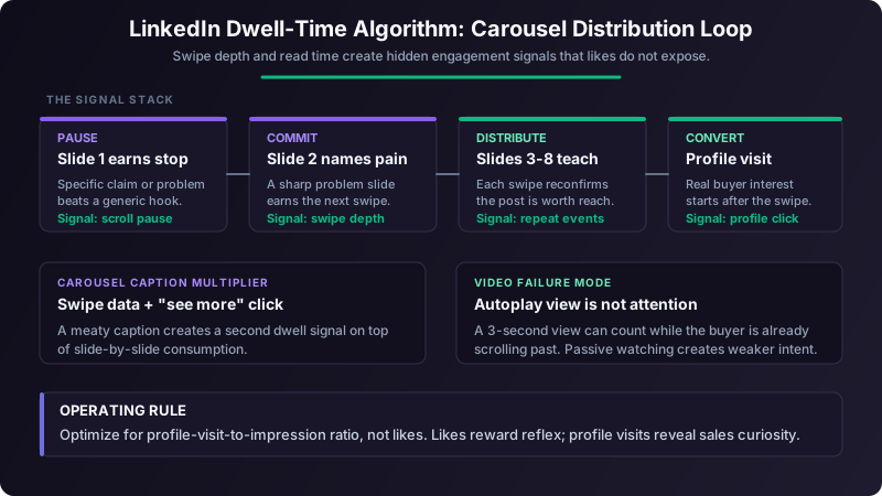
LinkedIn does not publish the weights in its feed ranking, so treat any precise claim about "the algorithm" with caution. What you can measure is attention and action: how far people swipe, whether they expand a caption, and whether they visit your profile afterward.
A post with few likes can still hold the attention of the right people, and a post with many reflexive reactions can reach no one who matters. For sales, the attention and the follow-on action are what count.
These are invisible engagement metrics. You can't see them in your notification tab, and nobody sends you a congratulatory message about your swipe-through rate. For sales teams, the implication is straightforward: favor formats that earn sustained attention from your buyers. Carousels are built for that.
Three attention behaviors are worth watching.
Swipe depth on carousels. When someone swipes from slide 1 to slide 7 of a 10-slide carousel, they have chosen to keep reading seven times. Each swipe is a fresh decision that the content is worth their time.
"See more" expansion clicks on text and captions. When a post exceeds the preview length and someone clicks to expand it, the opening earned full attention. This matters for carousel captions too, which comes up again below.
Time spent in comment threads. People who read through comments, even without replying, are showing interest in the conversation.
Format performance on LinkedIn shifts over time, and published format comparisons vary by sample and year. Test carousels against video and text with your own audience before you commit a team to one format.
The Attention Math: Why Swipes Outweigh Likes
Here is the logic with illustrative numbers, not benchmarks. Suppose 100 people swipe past slide 3 of a 10-slide carousel. Each of them has made several separate decisions to keep reading, and together they have spent real minutes with your ideas.
Now compare a short video that autoplays in the feed. A "view" can register while someone is already scrolling past, so a large view count can hide very little actual attention.
Each carousel swipe is a discrete re-engagement. Swipe from slide 3 to 4? A choice to continue. Swipe from slide 4 to 5? Another. Passive autoplay watching is a single, often weak signal by comparison.
There's a second attention layer most people miss. If your carousel has a caption that exceeds the preview length and someone clicks "see more," that click is an additional signal of interest on top of the swipes.
The 10-Slide Carousel Framework for Sales Leaders
Here's a slide-by-slide template.
The Slide Structure
- Slide 1 (Hook): A bold, specific claim or question. "[A real result you can back up.] Here is the framework behind it." Use minimum 32pt font. No logos, no fluff.
- Slide 2 (Problem): Name the pain your audience feels. "Most cold emails get deleted in 2 seconds because the opening line talks about the sender, not the buyer."
- Slide 3 (Data Point): One surprising number with context. "[One number from a source you can name, with its context.]"
- Slides 4 through 8 (Framework): One insight per slide. This is where you teach. Each slide should have a heading (6 to 8 words) and a supporting sentence (15 to 20 words). That's it.
- Slide 9 (Summary): Recap the 5 key points from slides 4 through 8 as a scannable list.
- Slide 10 (CTA): A specific ask. Not "Follow me for more." Instead: "DM me 'framework' and I'll send the full template."
Design Rules That Affect Swipe Completion
The one insight per slide rule is non-negotiable. When you cram two or three ideas onto a single slide, readers pause, get overwhelmed, and drop off. Long slides make readers stop swiping, so keep each one short.
Keep font size at a minimum of 24pt. Anything smaller is hard to read on a phone, where many people read LinkedIn. Use high-contrast color combinations: dark text on light backgrounds or white text on deep navy or charcoal.
Three Carousel Formulas That Work for B2B Sales
- 1"X Mistakes" format: "7 Discovery Call Mistakes That Kill Your Close Rate." Each slide covers one mistake with a one-line fix.
- 2"Before/After" framework: Show a bad cold email on one slide, then the rewritten version on the next. Repeat for 4 to 5 pairs.
- 3"Steal My Process" template: Walk through a real workflow you use daily. "Here's exactly how I research a prospect in 6 minutes before hitting send."
For tools, Canva's carousel templates work for most use cases. If your brand team uses Figma, the auto-layout feature makes batch production fast. And honestly, building slides in PowerPoint and exporting to PDF still works perfectly. LinkedIn accepts PDF uploads as carousels natively.
The slide after your opening hook determines whether someone continues or scrolls away. A generic problem such as "Sales is hard" gives the reader little reason to continue. Use a specific, recognizable problem instead, then ask whether the buyer you want to reach would keep the slide or send it to a colleague.
Collaborative Posts: Borrowing Your Prospect's Network
When you co-create a carousel with someone and both of you share it, it reaches both of your networks.
For sales teams, this is a pipeline play disguised as a content play.
Here's the move: identify a VP of Sales or Head of Revenue at one of your target accounts. Reach out with a specific co-creation pitch. Not "let's collaborate on content" (vague and ignorable). Instead:
"Hey [Name], I'm putting together a carousel on the 5 biggest pipeline mistakes we're both seeing in Q2. I'd love to include your perspective on [specific topic they've posted about]. I'll handle design and writing. Would you be open to co-authoring it? Takes 15 minutes of your time."
When that carousel goes live, it hits their entire network. You get warm visibility with their connections, many of whom match your ICP. The co-creation process itself builds relationship equity. You've now had a working interaction with a target account decision-maker, which is infinitely more valuable than a cold outbound touch.
One critical mistake to avoid: don't collaborate with peers at your own seniority level or at non-target companies. The whole point is to access their network. Collaborating with another SDR at a similar-stage startup gives you overlapping audiences with limited pipeline value.
When Video Still Wins (and When It Doesn't)
I'm not anti-video. There are specific contexts where video outperforms carousels.
Trust-building for AE-level relationships is one. When a prospect is evaluating you personally (not your company, not your product, you), a 60-second video where they hear your voice and see your face builds familiarity that no PDF can match. Post-discovery call video follow-ups, for example, are powerful.
Event recap clips under 45 seconds work because the visual context (conference floor, booth, panel stage) adds credibility that's hard to replicate in static slides. Customer testimonial snippets also perform well because the social proof is embedded in the format itself.
For video to work on LinkedIn, you need a hook that lands in the first few seconds (before autoplay scroll-past), burned-in captions (many people watch with the sound off), and a total length under 90 seconds.
| Format | Attention Pattern | Best Use Case |
|---|---|---|
| Carousel (PDF) | Repeated swipes, one idea at a time | Education, frameworks, process walkthroughs |
| Text-only | A "see more" click if the opening lands | Hot takes, short stories |
| Native Video | Autoplay views; real attention only if the hook lands | Trust-building, testimonials, event recaps |
| Image Post | A quick glance | Data visualizations, quick announcements |
| Newsletter | Long reads from subscribers | Long-form thought leadership |
The decision framework is simple: use video when the goal is authority and trust with a specific person or small group. Use carousels when the goal is distribution and education across a broad ICP audience.
Tracking Invisible Engagement Without Premium Analytics
Check what LinkedIn's post analytics show for your carousels. Use whatever attention data is available, and fall back on profile visits where it is not.
But the most useful metric isn't in LinkedIn's dashboard. It's what I call the engagement quality score: profile visits divided by impressions. Not likes divided by impressions. Profile visits.
Here's why. A like is a reflex that takes a fraction of a second. A profile visit means someone was interested enough in you (not just your content) to click through and evaluate whether you're worth connecting with. That's a buying signal for sales teams.
Weekly Tracking Framework
Set up a simple spreadsheet with these columns:
- Post date
- Format (carousel, video, text, image)
- Topic
- Impressions (7-day total)
- Profile visits (from LinkedIn's "Who viewed your profile" section, filtered to that week)
- Connection requests received
- DMs received
- Engagement quality score (profile visits / impressions)
Track this weekly for each SDR on the team. After four weeks, you'll have enough data to identify which topics and formats generate the highest quality score. SDR managers should treat this data with the same seriousness as call volume and email reply rates. Content performance is a leading indicator of outbound effectiveness, because a prospect who already recognizes your name from a carousel may be more willing to open and answer your cold email.
Your First Carousel Ships This Week
Here's your 30-minute action plan.
Minutes 1 through 10: Pick one insight from your sales process that you explain to every new rep. Maybe it's how you write a first-line personalization. Maybe it's the three signals you check before adding someone to a sequence. Whatever it is, you already know the content.
Minutes 10 through 25: Open Canva, select a carousel template, and build 10 slides using the framework from this article. Slide 1 is your hook. Slide 2 names the problem. Slide 3 drops a number. Slides 4 through 8 teach the framework, one point per slide. Slide 9 summarizes. Slide 10 asks for a DM.
Minutes 25 through 30: Write a caption (3 to 5 sentences, with the first sentence front-loading value so the preview text hooks). Export to PDF. Upload to LinkedIn. Publish when your audience is most active, based on your own post analytics.
The one metric to start tracking this week: profile-visit-to-impression ratio. Set a baseline from your last few posts, then watch whether carousels lift it. If the ratio stays flat, your content is getting seen but not compelling anyone to learn more about you.
Remember the illustrative sales leader from the opening? Her video had more likes, but her carousel drove far more of the behavior that actually fills a pipeline: someone thinking, "Who is this person, and should I talk to them?"
Make one carousel per week a team-level activity goal. Not because content is more important than outbound. But because content compounds. By week 8, your SDRs will have a library of carousels working for them 24/7, warming up prospects before the first cold touch ever lands.
References
[1]Gartner, "Gartner Sales Survey Finds 61% of B2B Buyers Prefer a Rep-Free Buying Experience," press release, June 25, 2025, as republished by MarketScreener. https://uk.marketscreener.com/quote/stock/GARTNER-INC-40311131/news/Gartner-Sales-Survey-Finds-61-of-B2B-Buyers-Prefer-a-Rep-Free-Buying-Experience-50340554/
Ready to transform your sales pipeline?
See how Prospectory's AI-powered platform can help your team research, reach, and relate to prospects at scale.
Related Articles
LinkedIn Commenting for Social Selling: A Practical Playbook
Use thoughtful LinkedIn comments to learn from target buyers, start relevant conversations, and measure whether those conversations create qualified pipeline.
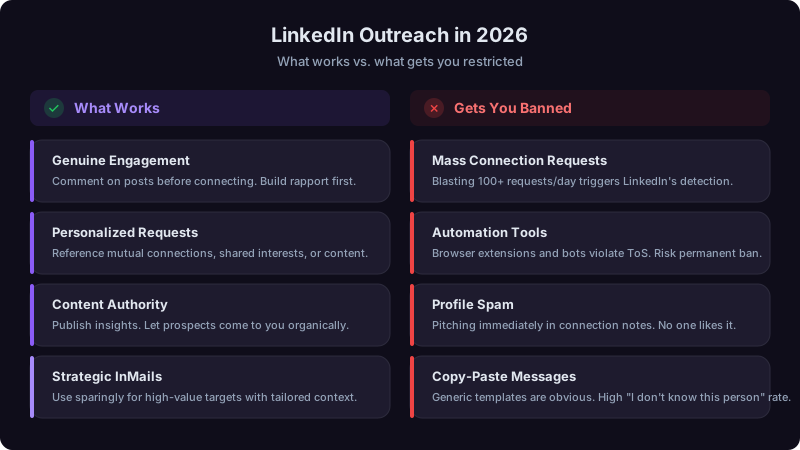
LinkedIn Outreach in 2026: What Still Works (And What Gets You Banned)
LinkedIn has cracked down on automation. Here's how to use the platform effectively for sales without risking your account.
Reddit Prospecting for B2B: The 9:1 Rule for Earning Trust Before You Sell
Reddit hosts raw buyer intent in buyers' own words, but sales tactics get you banned. Here is a months-long credibility playbook, a 9:1 contribution rule, and a respectful qualification workflow.